One shelf, every maker.
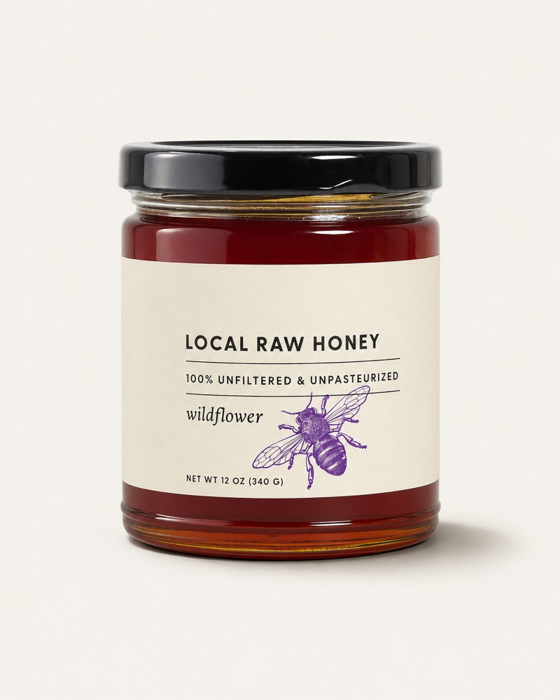
Every product on Placemade sits on the same warm grey, at the same scale, in the same soft light. So a row of goods from different makers reads as one shelf, and the only thing that changes is the product. Here’s how to shoot yours to match, and how we can help.
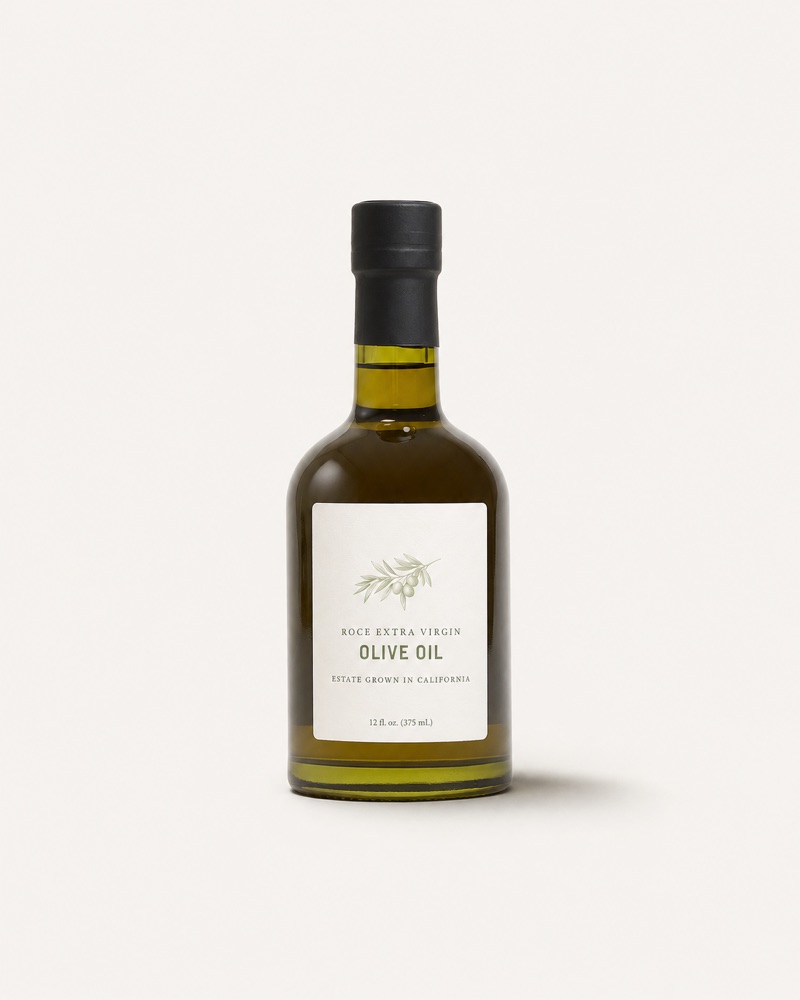
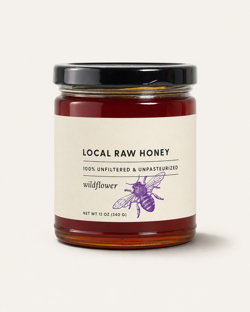
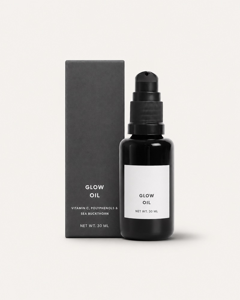
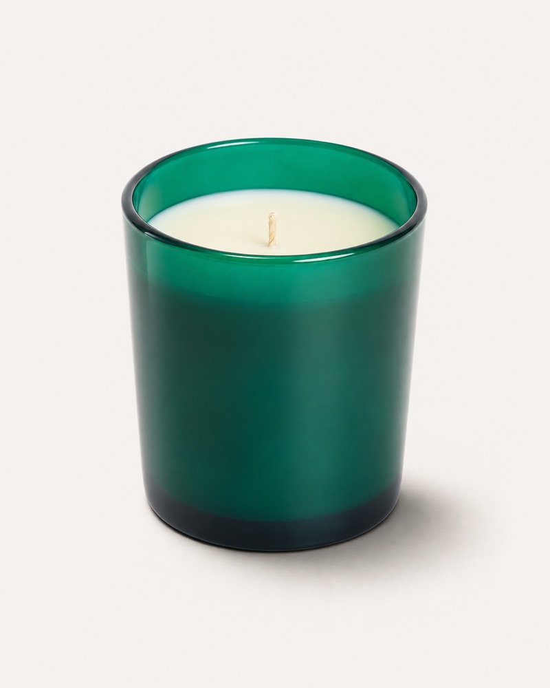
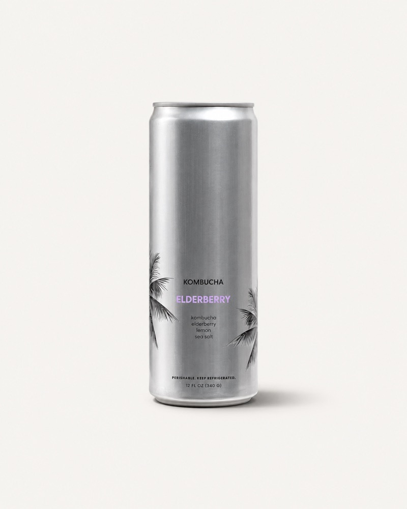
The same five products, two ways.
Customers browse a row of tiles. When every photo is lit and framed its own way, the eye jumps to the backgrounds. When they match, it lands on your product.
The four specs.
- Ground
- #F2F1ED paper sweepA warm light grey, never white. We match every photo to it.
- Frame
- 4:5 · 2000 × 2500 pxUpright, a little taller than wide.
- Light
- Soft, from the leftOne light, one soft shadow.
- File
- JPEG · sRGB · under 5 MBStraight from the camera, no filters.
A table, a sheet of paper and a window.
No studio needed. This is the whole setup, from above and from the side. The numbers match the list.
- 1The sweepA sheet of warm light-grey paper, taped to the wall and curved down onto the table, so there’s no line behind the product.
- 2The productIn the middle of the paper, upright, with the front label square to the camera.
- 3Soft light from the leftA window with indirect daylight, or one softbox. Turn other lights off so the colors don’t mix.
- 4A white card on the rightAny white board or foam card. It bounces light back so the shadow stays soft.
- 5The cameraStraight in front, level with the middle of the label, on a tripod or a steady stack of books.
Centred, upright, at one scale.
Tall bottles and short jars sit at the same scale, so a row of products reads as one shelf. Frame every product like this:
- 1Centred left to right, between the two lines.
- 2Front label square to the camera, sharp enough to read.
- 3A little room above and below. Nothing cut off.
- 4One soft shadow, falling down and to the right.
The front, the label, and one in use.
The first goes on your tile in the shop. The second lets customers read the label. The third shows it in its place.
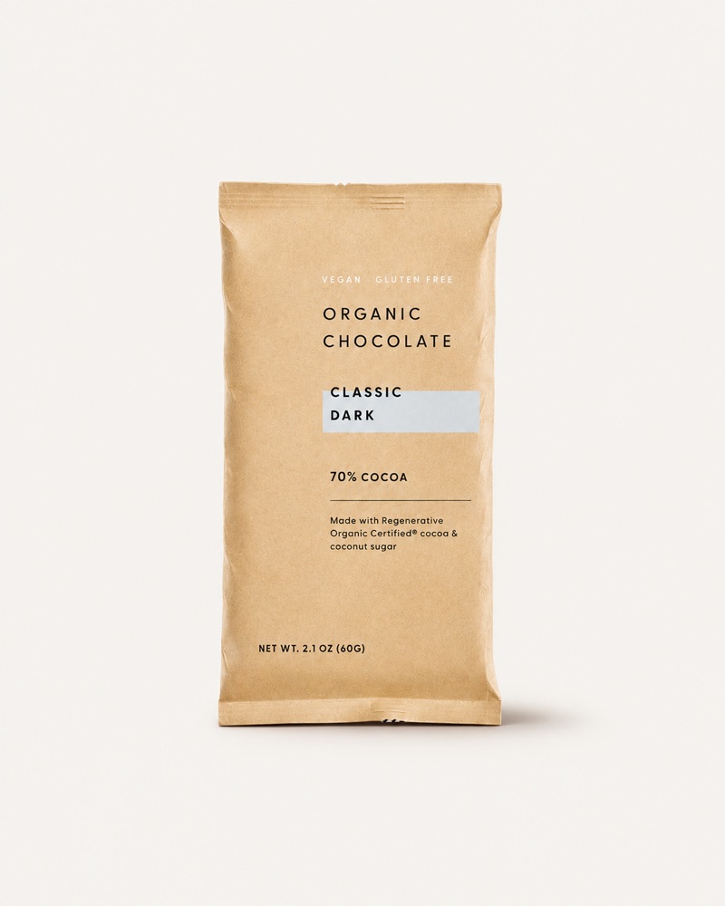 1 The front, on the sweepCentred, label to the camera, nothing else in the frame. This one goes on your tile.
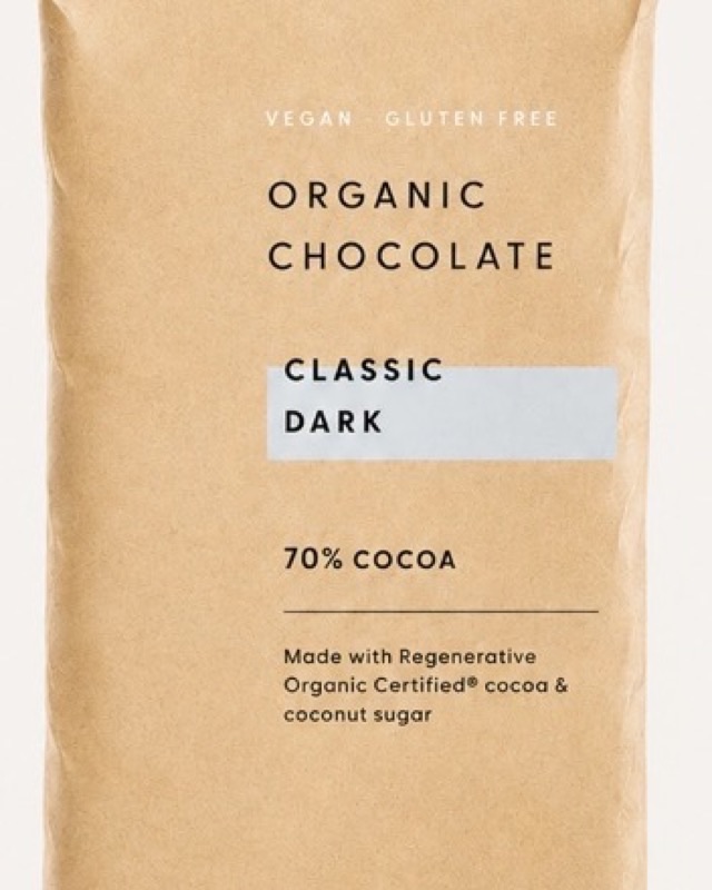 2 The label, up closeClose enough to read the name, the ingredients and what makes it yours.
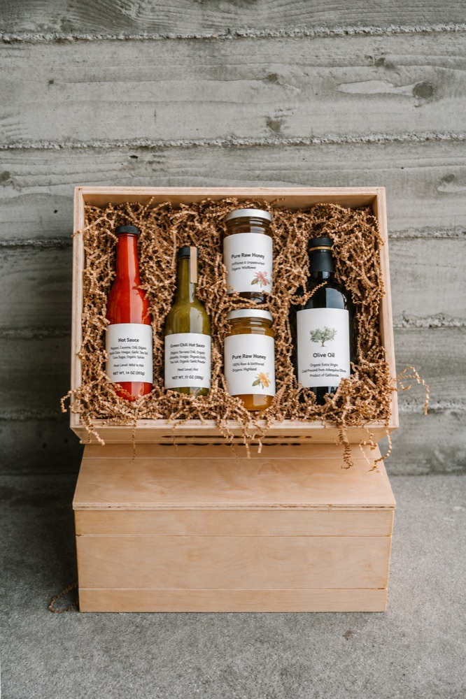
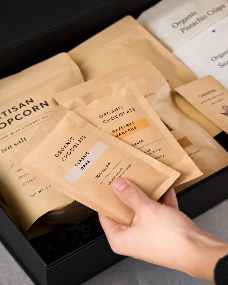 3 One in useIn its place, in a hand or on a table. The only photo with props.
What we look for when we review.
A phone is plenty.
Most makers shoot on their phone. Six habits make the difference.
- Shoot by a windowDaylight from your left, out of direct sun. Overhead lights off.
- Grey paper, not whiteA large sheet of warm light-grey card, curved from the wall onto the table.
- Flash off, no filtersFlash makes hard shadows, and filters change the color of your label.
- Step back, zoom to 2×Up close, a phone’s wide lens bends bottles. From further back, edges stay straight.
- Tap the label to focusThe name and ingredients should be sharp enough to read.
- Turn on the gridYour camera’s grid lines help you keep the product upright and centred.
Need a hand with your photos?
You don’t have to get them perfect on your own. We can edit the photos you take, or shoot them for you.
A last check.
Name the files by product and size, in order, so we know which is which.
- Three photos per product: front, label, in use
- JPEG, sRGB, 2000 × 2500 px or larger
- No added text, logos or watermarks
- Shot in the last six months, matching what ships